The Avonni component library

The Salesforce component library. Every surface you build on.

Data tables, kanban boards, maps, timelines, charts, forms, and more. The same components across Screen Flows, Lightning pages, and Experience Cloud sites.

85+
components across four packages
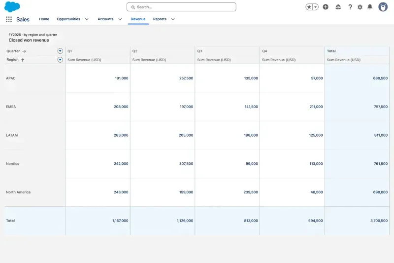
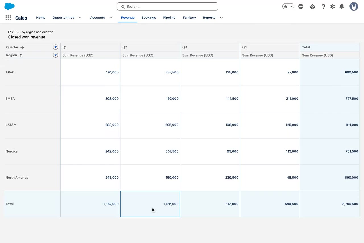
Revenue pivot table by region and quarter
Pivot Table·Dynamic Components
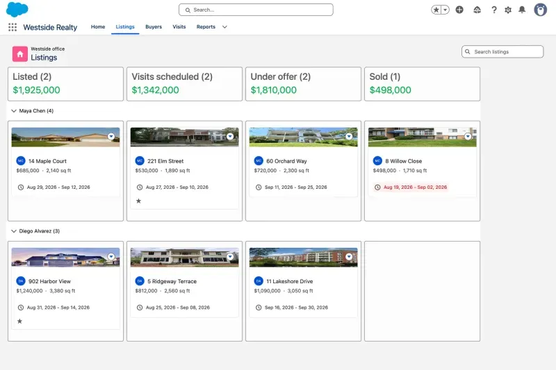
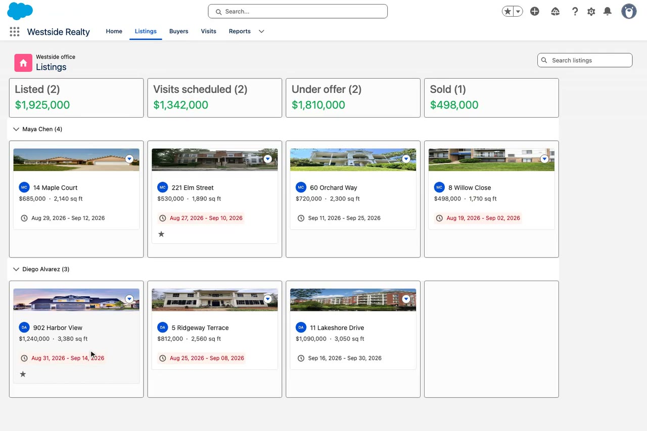
Kanban board of property listings by stage
Kanban·Dynamic Components
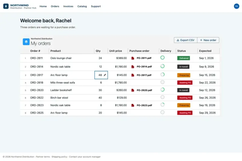
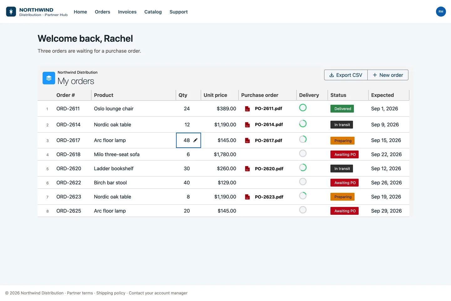
Partner portal order table on Experience Cloud
Data Table·Experience Cloud
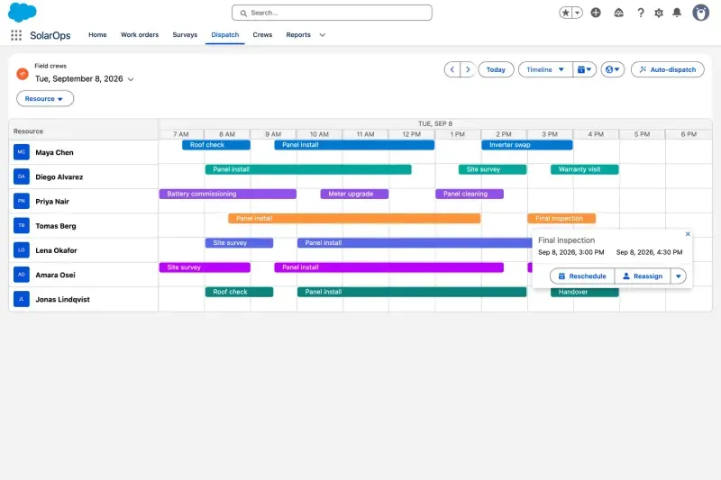
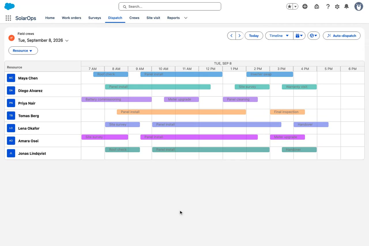
Crew scheduling calendar built with Avonni LWC
Calendar·LWC
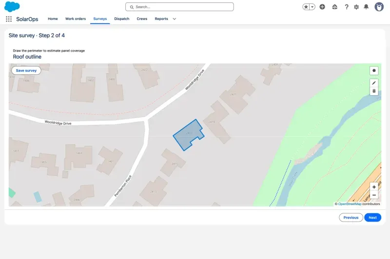
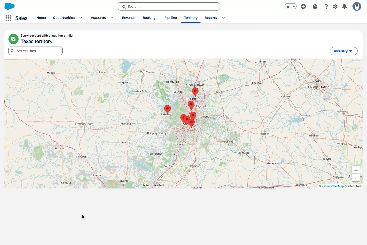
Map inside a site survey screen flow
Map·Flow Screen Components
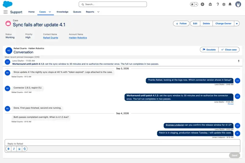
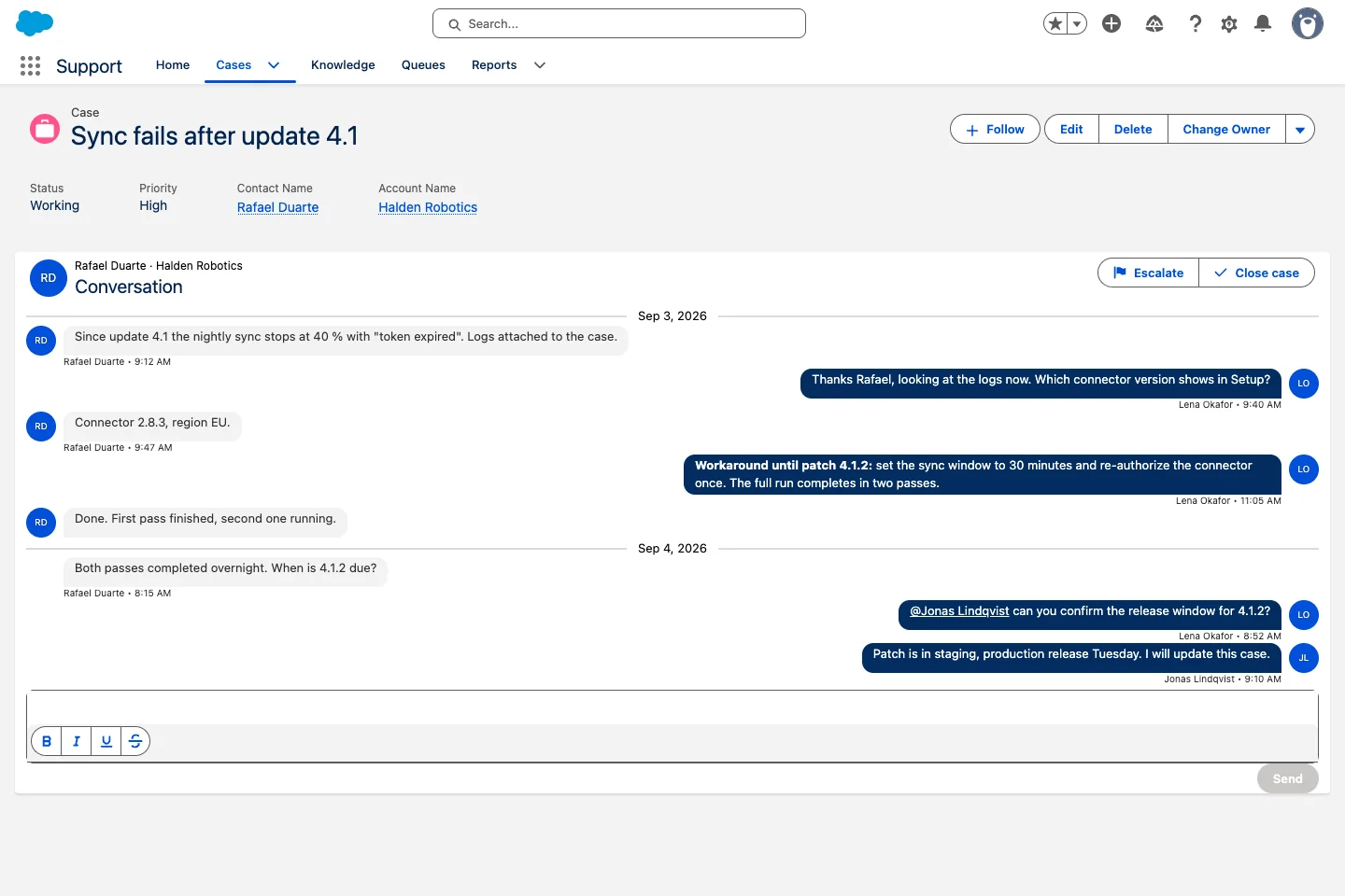
Case conversation thread on a record page
Chat·Dynamic Components
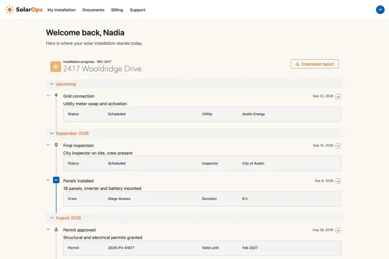
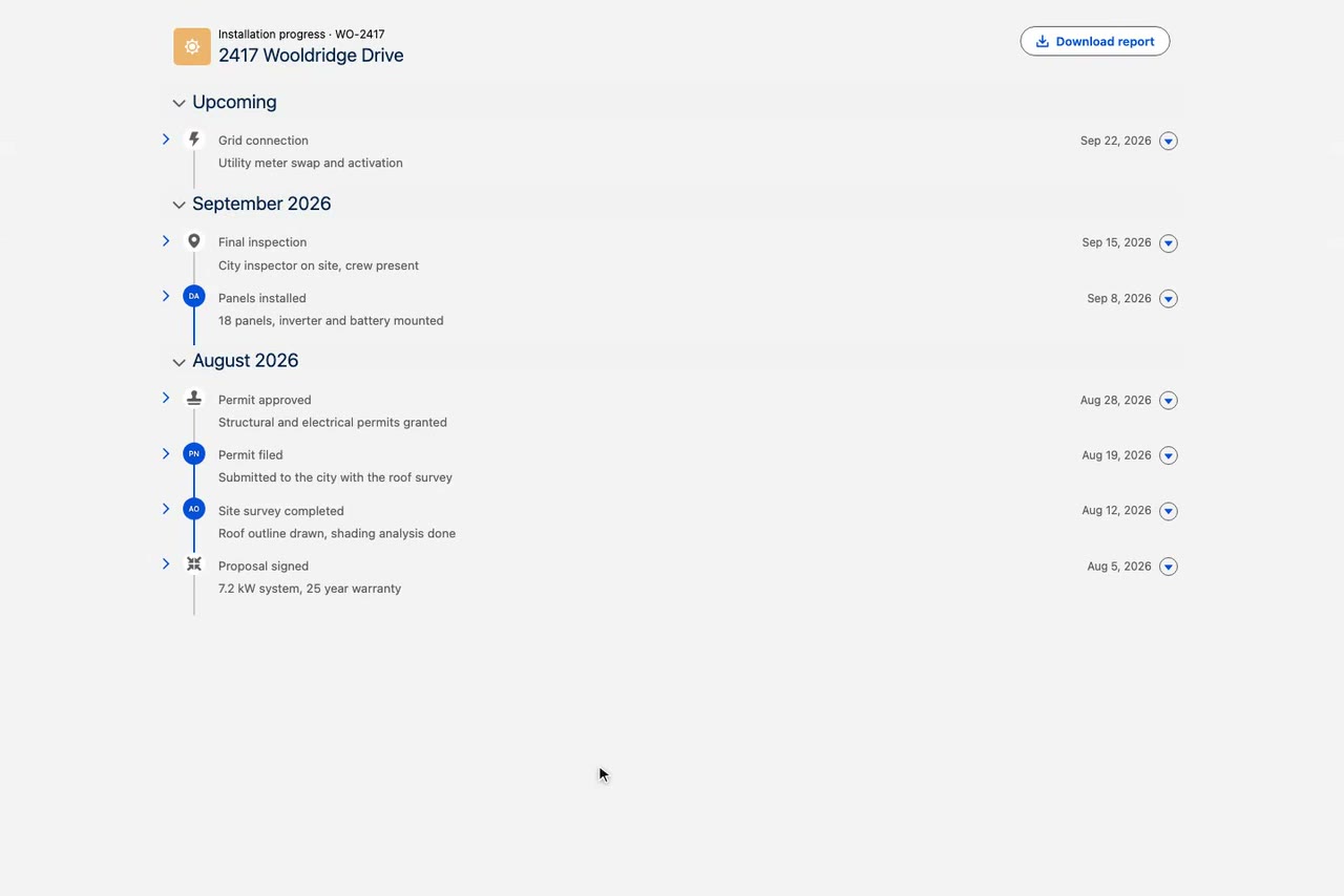
Installation timeline on a customer portal
Timeline·Experience Cloud
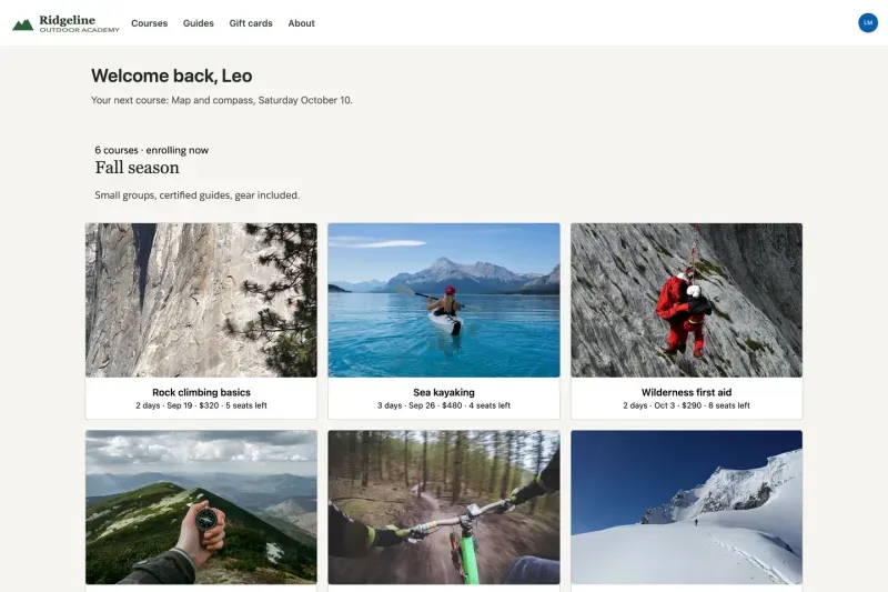
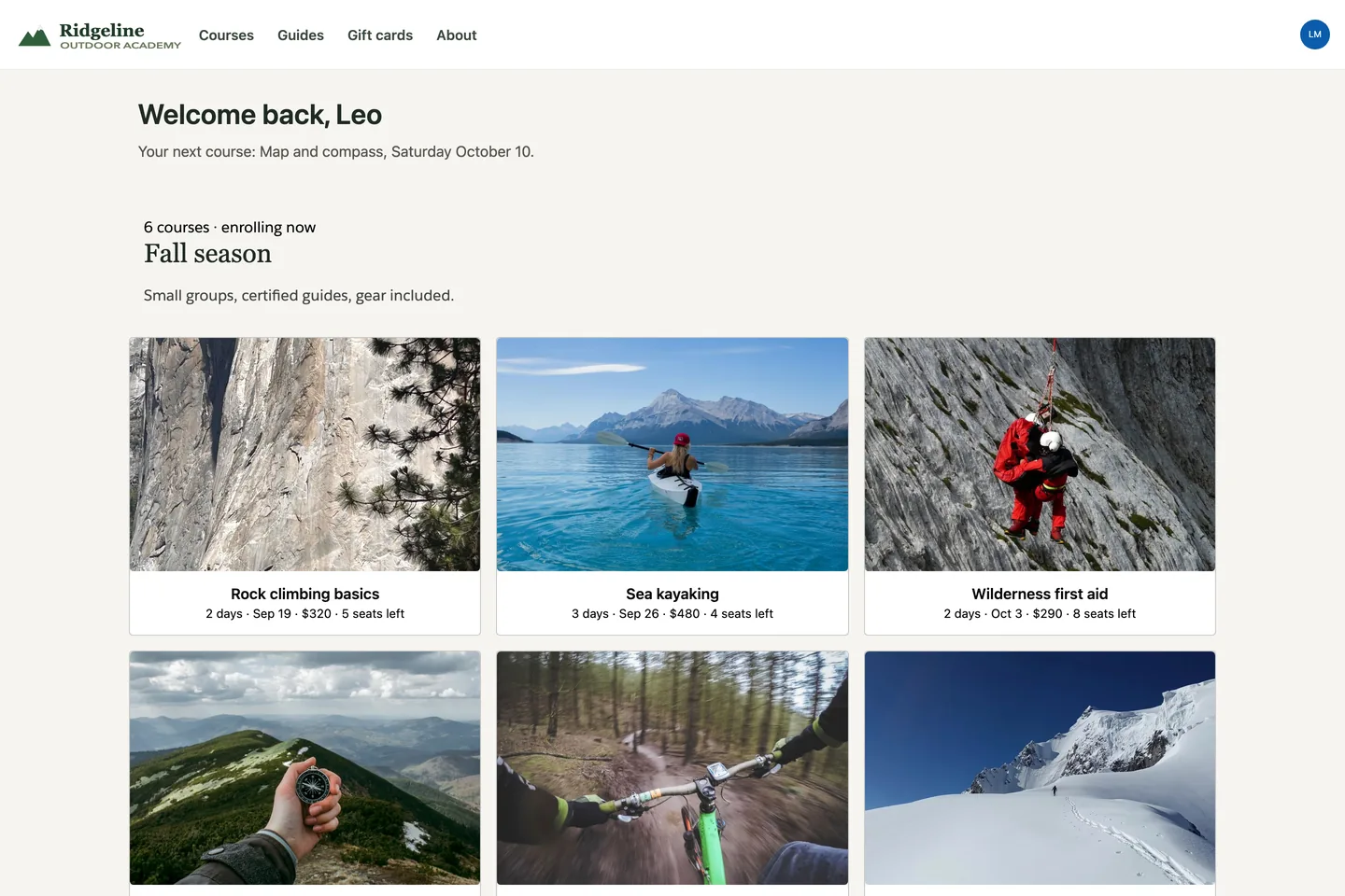
Course catalog gallery on an Experience Cloud site
Gallery·Experience Cloud
How it works

Pick a component. Configure it. Ship it anywhere.

Every Avonni component follows the same path from idea to production. The surface changes, the workflow does not.

1

Pick a component

Choose from 85+ components: data tables, kanban boards, maps, timelines, forms, charts, and more.

2

Configure it in your builder

Set fields, filters, and actions with clicks in Flow Builder, the Dynamic Components builder, or the Experience Cloud editor.

3

Ship it where you build

Drop the result into Screen Flows, onto Lightning pages, or into portals. The same component, on every surface.

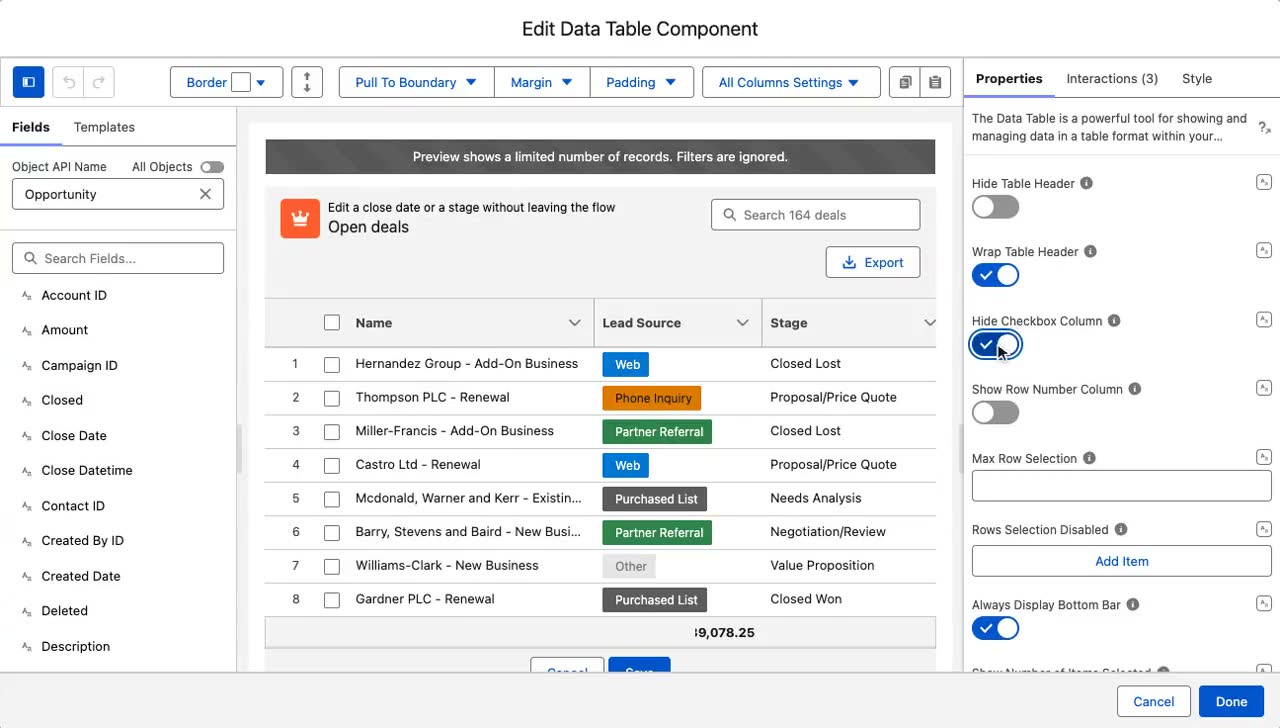
The Flow Component Builder open on an Avonni Data Table

The Flow Component Builder, configuring a Data Table.

The library

Start with a signature component

Each one has its own deep-dive page showing what it does and every surface it runs on. These are the components teams reach for first.

LWC Components

Production components for developers

Documented markup your AI tools compose, ready to drop into any Lightning Web Component.

55+
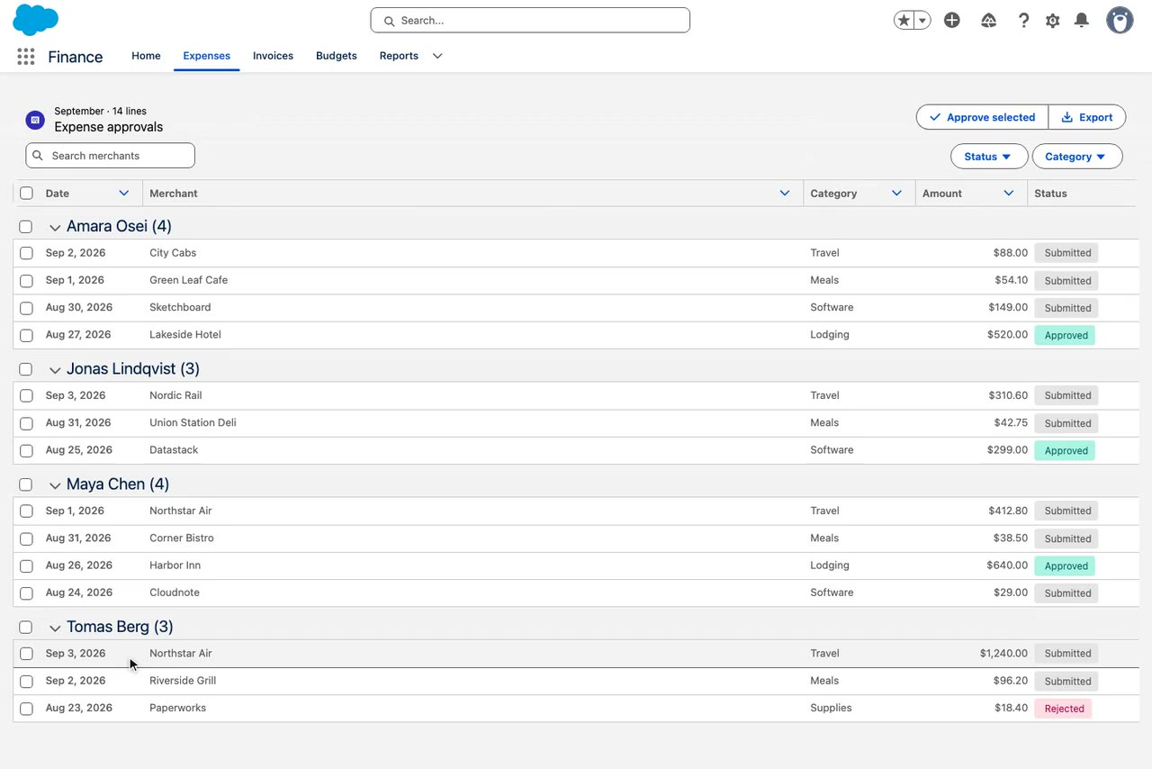
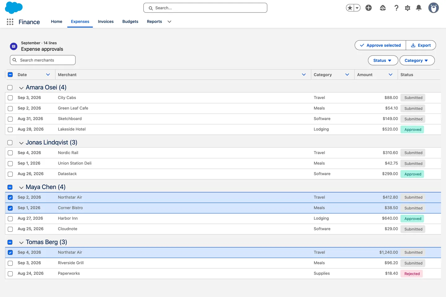
Expense approvals built with the Avonni Data Table in a custom LWC

Expense approvals: the Avonni Data Table, grouped by employee, inside a custom LWC.

Data Table
Metric
Progress Circle
Rating
Combobox
Avatar Group
Color Picker
Timeline
Dual Listbox
Slider
Progress Indicator
Chip Container
Dynamic Components

The largest catalog, no code required

Build data apps on record and app pages with clicks, from tables to kanban to charts.

85+
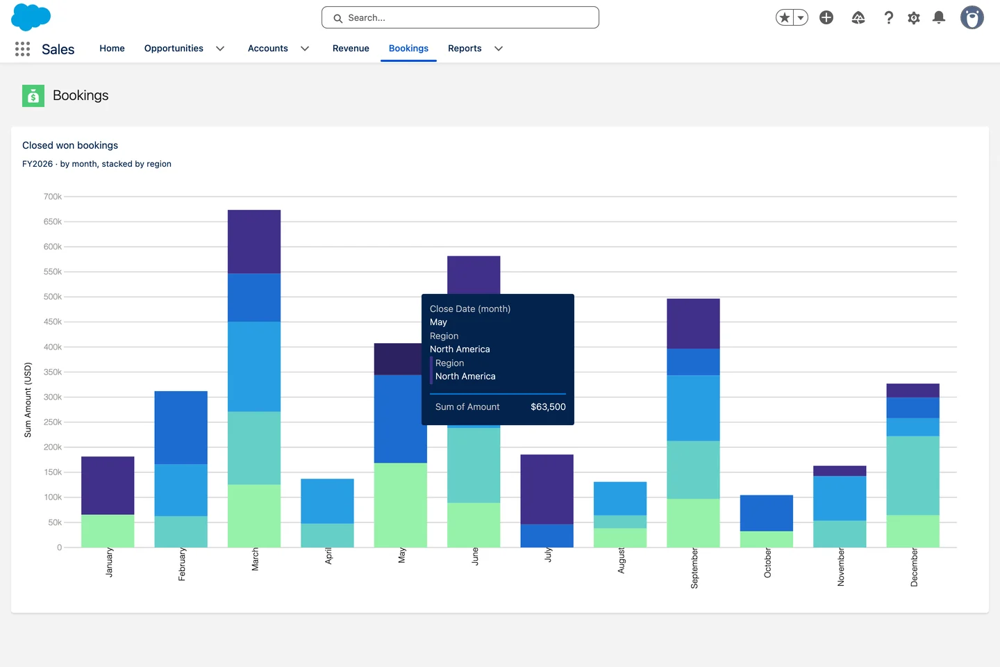
Bookings by region chart built with Avonni Dynamic Components on a Lightning page

Bookings by region: an Avonni Chart on a Lightning page, stacked by region.

Kanban
Datatable
Pivot Table
Chart
Metric
Tree
Progress Bar
Scheduler
Combobox
Badge
Status
Date Range
Flow Screen Components

Rich screens for your flows

Turn plain screen flows into guided, data-rich experiences.

70+
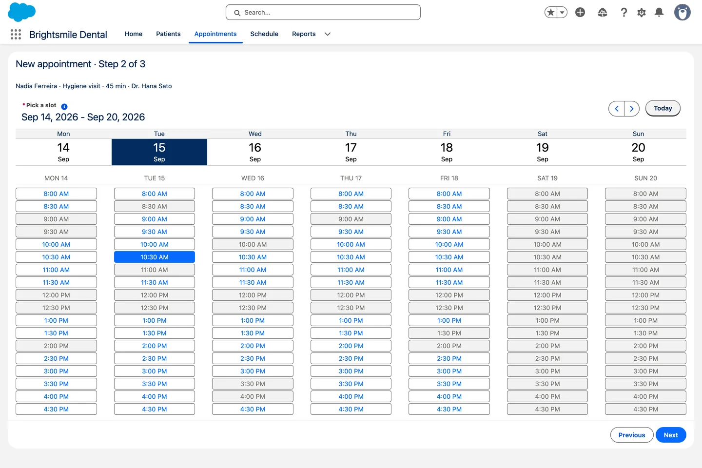
Appointment booking screen flow with the Avonni Date Time Picker

Book an appointment: the Avonni Date Time Picker as step 2 of a screen flow.

Data Table
Visual Picker
Choice Set
Progress Indicator
Rating
Date Picker
Metric
Chart
Combobox
Barcode
Slider
Counter
Experience Cloud Components

Portal-ready components

Bring the same rich components to your Experience Cloud sites and portals.

40+
Course catalog gallery on an Experience Cloud site built with Avonni

Course catalog: an Avonni Gallery on an Experience Cloud site.

Datatable
Card
Metric
Kanban
Progress Circle
Avatar Group
Gallery
Tabs
Banner
Social Links
Chip Container
Progress Indicator

Same component, every surface

Configure a component once and it runs the same way wherever you place it. What changes is the surface, not what the component can do.

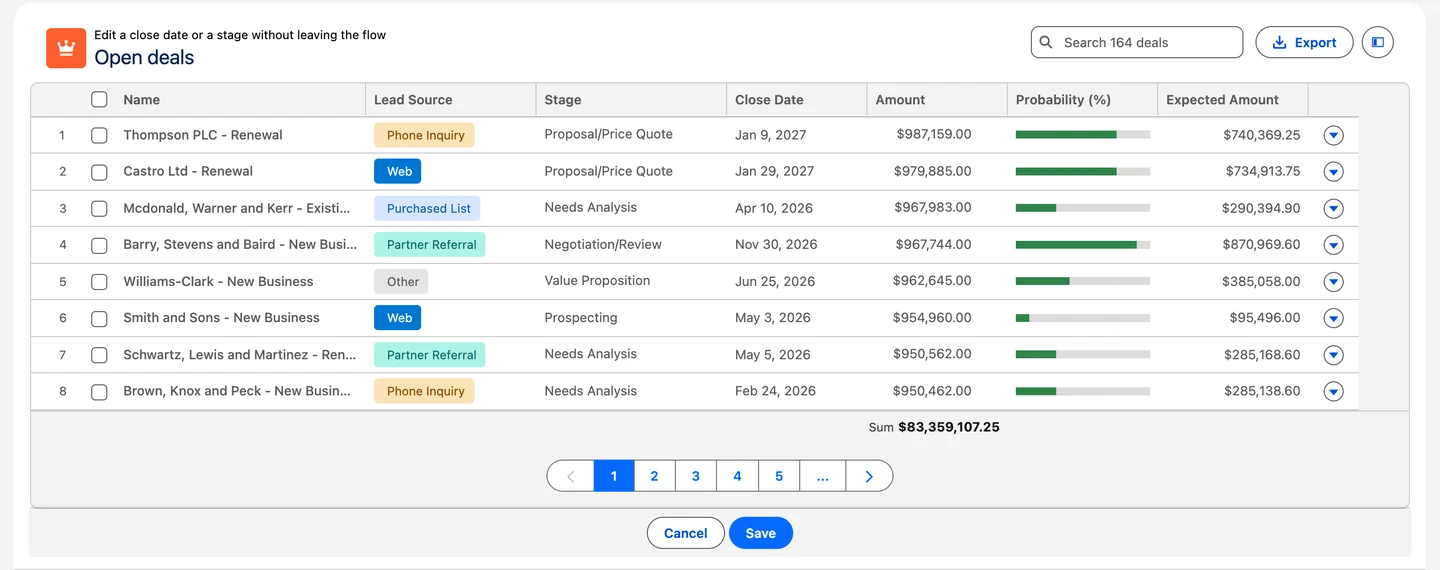
Avonni Data Table with inline edit inside a Salesforce screen flow
Screen Flow

Inline edit, then Save, inside a flow screen.

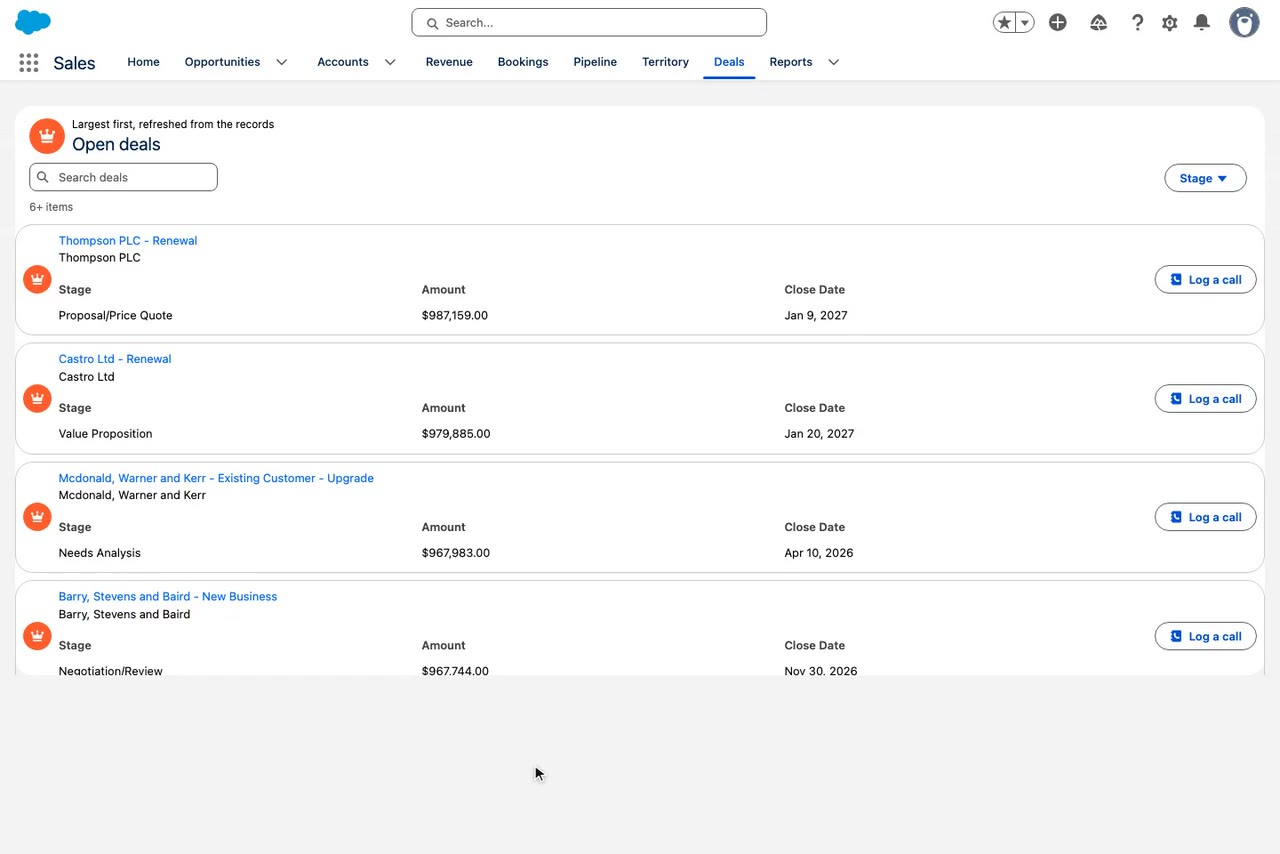
Related opportunities table rebuilt with Avonni Dynamic Components
Lightning page

A related list rebuilt with Dynamic Components.

Partner open orders table on an Experience Cloud portal
Experience Cloud portal

A partner's open orders, on their own portal.

Grouped expense rows with bulk actions in a custom LWC
Your own LWC

Grouped rows and bulk actions, in code you own.

Questions

The library, answered

What is a Salesforce component library?

A set of ready-made UI components you drop into Salesforce instead of building them in code. The Avonni library covers 85+ components, from data tables and kanban boards to maps, calendars and charts, and each one runs in Screen Flows, on Lightning pages, in Experience Cloud sites or inside your own LWC.

How is this different from Salesforce's Lightning Component Library?

Salesforce's Lightning Component Library documents the base components that ship with the platform. Avonni adds components the base library doesn't include, like pivot tables, kanban boards, calendars and chat threads, and makes them configurable with clicks as well as code.

How is the library different from the packages?

The library is the full set of components you can use. The packages are how they are delivered: Flow Screen Components, Dynamic Components, Experience Cloud Components, and LWC Components. Most components appear in more than one package so you can use them wherever you build.

Is there a free option?

Yes. Every Avonni plan starts free with 10 production licenses, and the full library is included from the start. You only pay as your team grows.

Where can I use these components?

On Salesforce Screen Flows, on Lightning record and app pages, in Experience Cloud portals and sites, and inside your own Lightning Web Components. The same component works across each surface it supports.

Can developers extend the components?

Yes. Admins configure everything with clicks, and developers can use the LWC versions with documented attributes, events, and styling hooks. The Avonni MCP server exposes those same APIs to AI tools.

One library. Start building today.

Install free from the AppExchange and add your first component to a Flow, page, or portal. Talk to us when you are ready to scale.