Login

 Get Started
Get Started
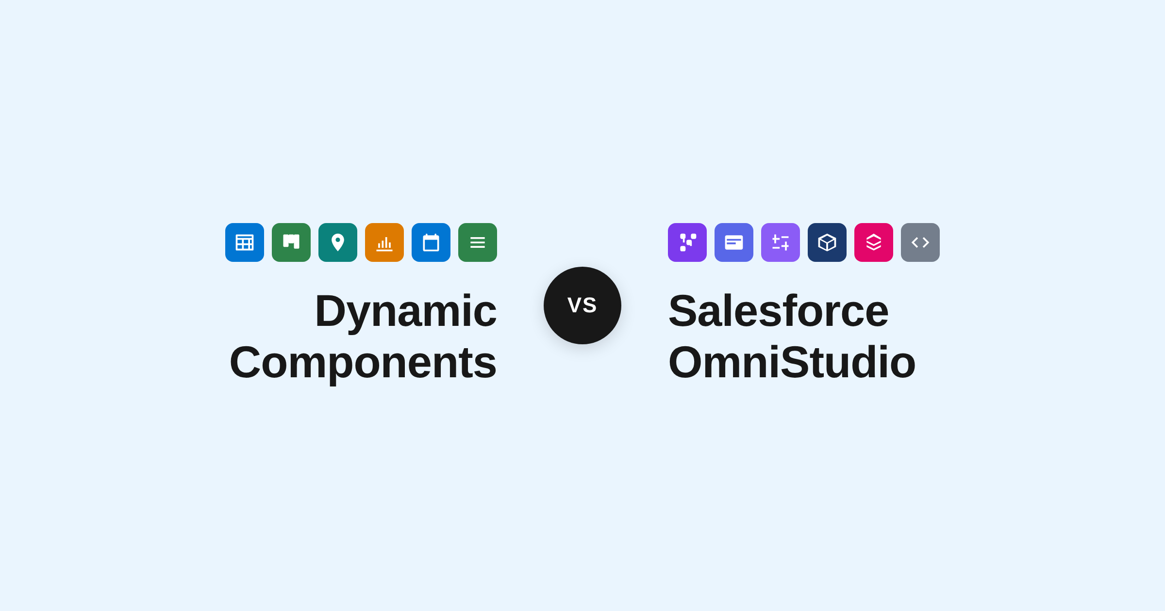
Avonni Components Package
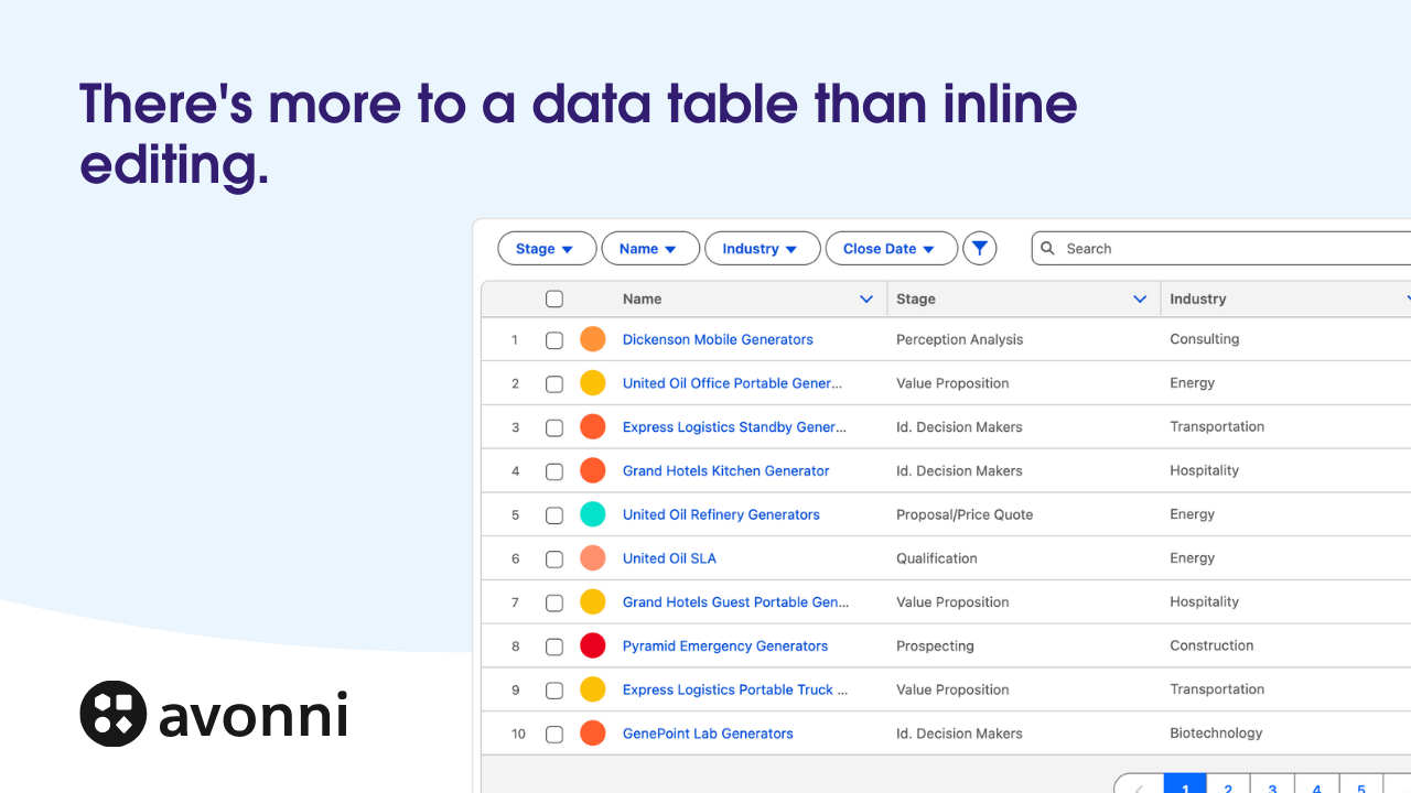
Take Your Salesforce User Experience to the Next Level. Create Salesforce Apps 10x faster.
- 70+ Flow Screen Components
- 40+ Experience Cloud Components
- Free up to 10 users
- 70+ Flow Screen Components
- 40+ Experience Cloud Components
- Free up to 10 users
Avonni Components passed Salesforce's security review and is listed on the AppExchange
Install in ProductionInstall in a SandboxAvonni Designer
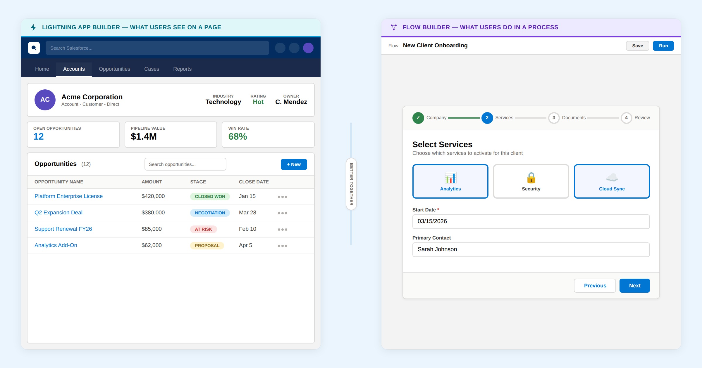
Prototype your Salesforce Applications in minutes.
- Lightning Applications
- Lightning Pages
- Lightning Web Component
Try for freeLogin- Lightning Applications
- Lightning Pages
- Lightning Web Component
Get Started
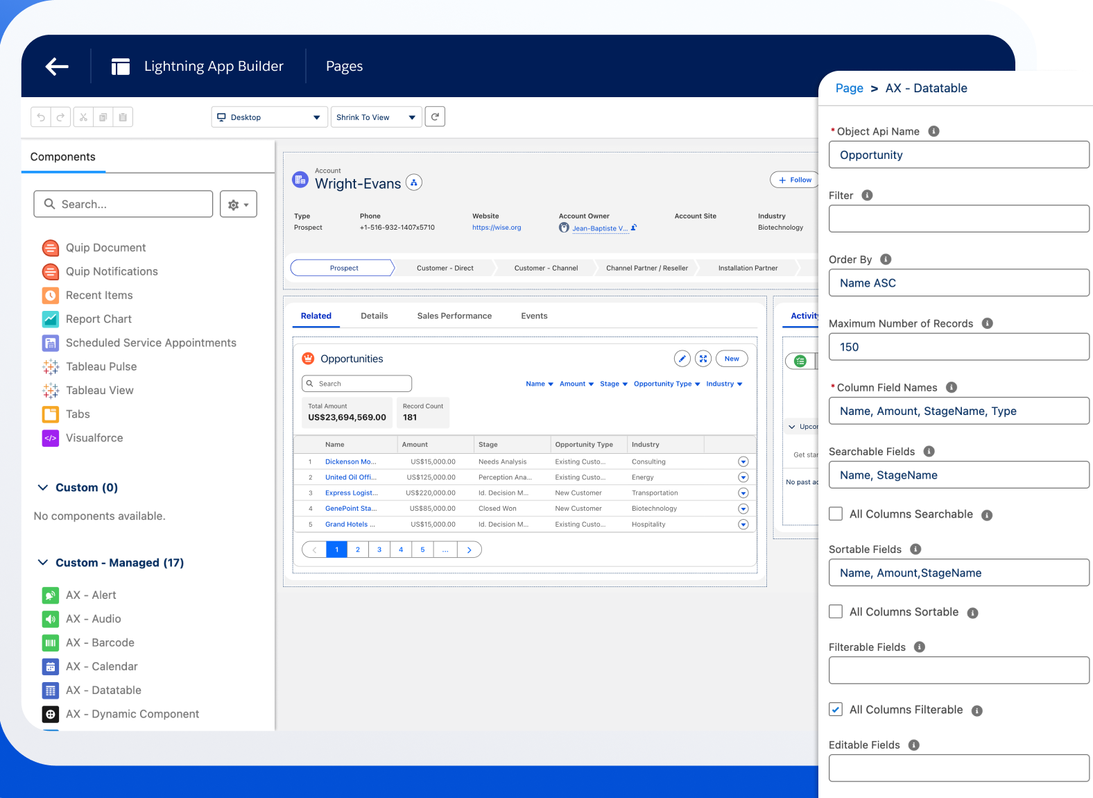
Avonni Components for App & Record Pages
Build powerful, fully customizable Lightning pages and Experience Sites
15+ App Builder Components
85+ Dynamic Components
40+ Experience Sites Components
Passed the Security review
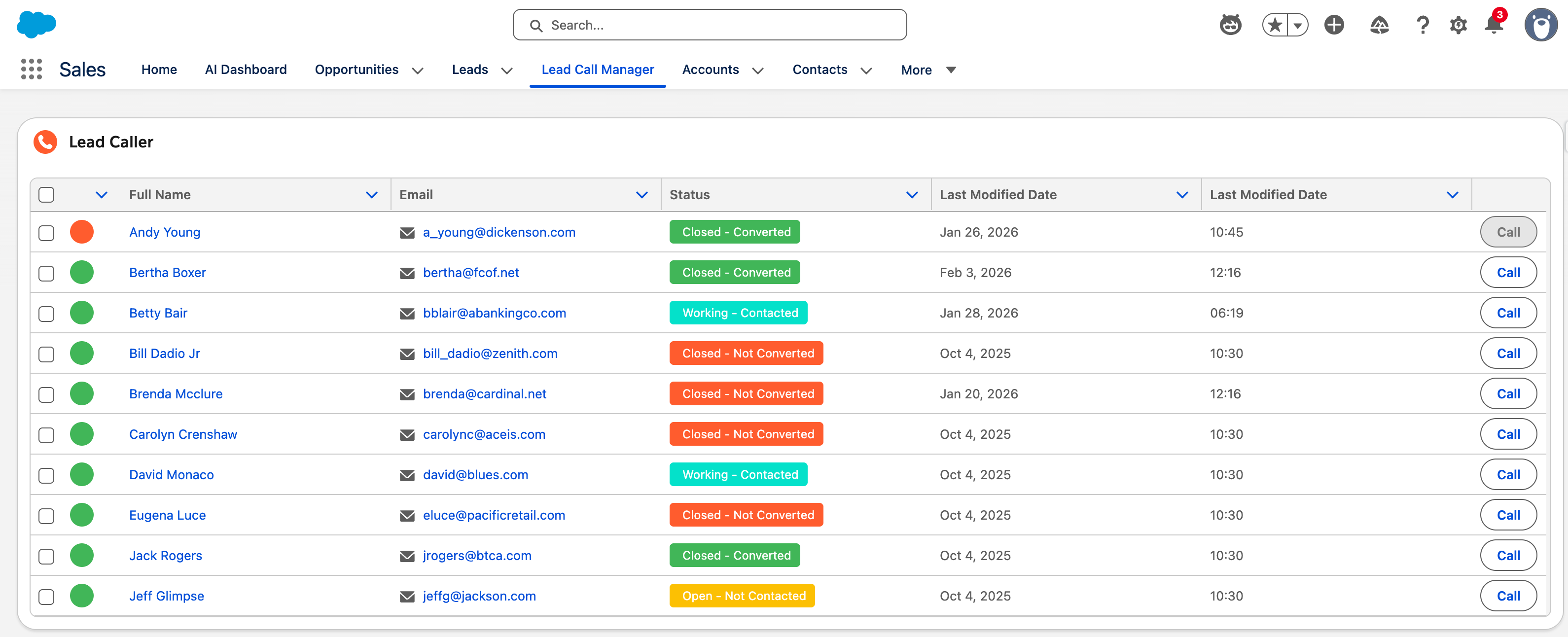
Avonni Components for Flows & Experience Sites
Create multi-step wizards and guided processes with 70+ Screen Flow components
70+ Components for Flows
No-code customization
Passed the Security review
Get Started
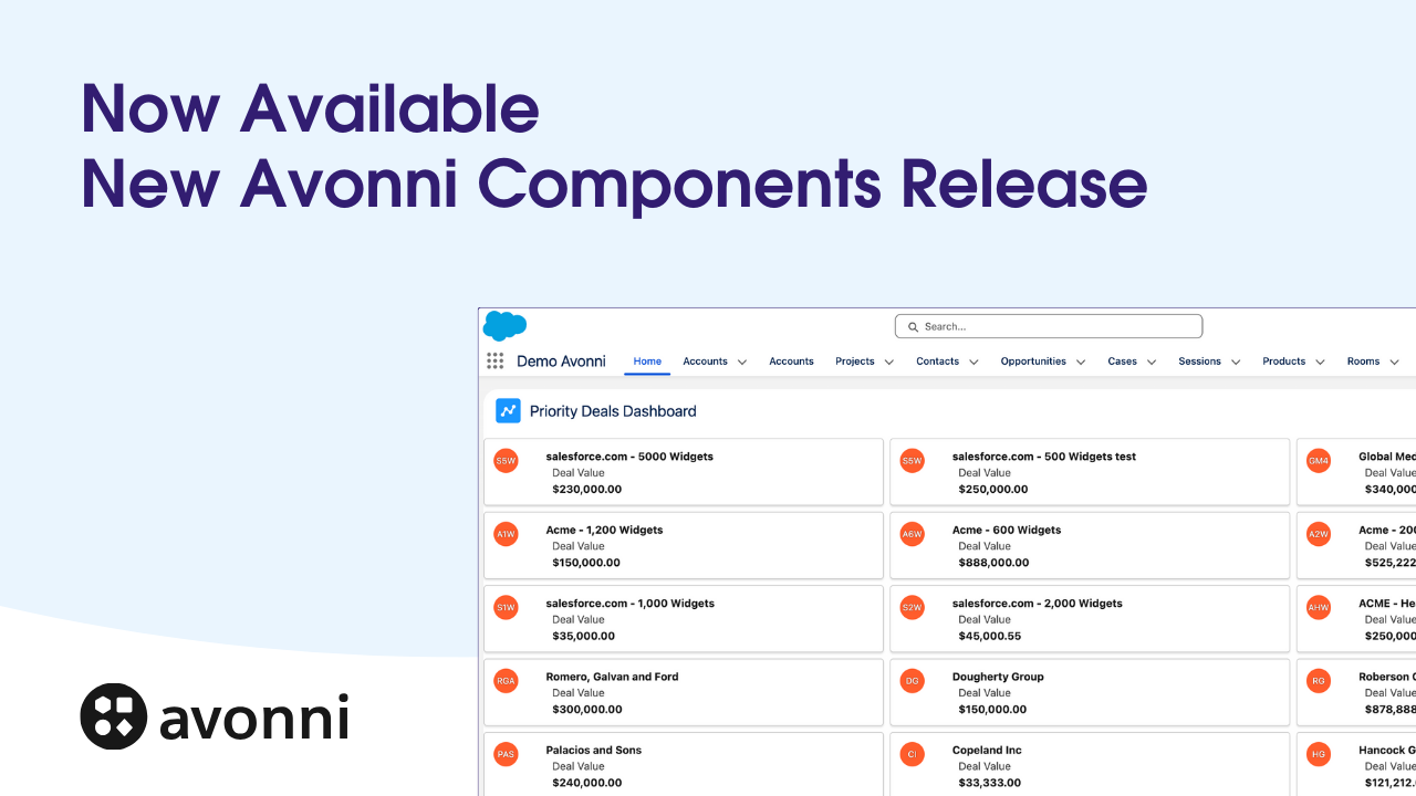
Avonni Components package
Take Your Salesforce User Experience to the Next Level. Create Salesforce Apps 10x faster.
- 60+ Flow Screen Components
- 30+ Experience Cloud Components
- Free up to 10 users
- 60+ Flow Screen Components
- 30+ Experience Cloud Components
- Free up to 10 users
Avonni Components passed Salesforce's security review and is on the AppExchange
Install in ProductionInstall in a SandboxGet Started
Avonni Experience Components
Build powerful, fully customizable Lightning pages and Experience Sites
15+ App Builder Components
85+ Dynamic Components
40+ Experience Sites Components
Passed the Security review
Avonni Flow Screen Components
Create multi-step wizards and guided processes with 70+ Screen Flow components
70+ Components for Flows
No-code customization
Passed the Security review
Avonni Designer
Login


%20(Vignette%20YouTube)%20(10).png)
%20(Vignette%20YouTube)%20(65).png)