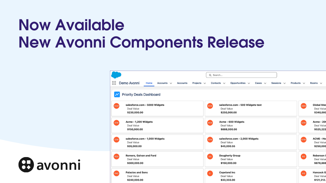
Take Your Salesforce User Experience to the Next Level. Create Salesforce Apps 10x faster. - 70+ Flow Screen Components - 40+ Experience Cloud Components - Free up to 10 users
Avonni Components passed Salesforce's security review and is listed on the AppExchange
Take Your Salesforce User Experience to the Next Level. Create Salesforce Apps 10x faster. - 60+ Flow Screen Components - 30+ Experience Cloud Components - Free up to 10 users
Avonni Components passed Salesforce's security review and is on the AppExchange
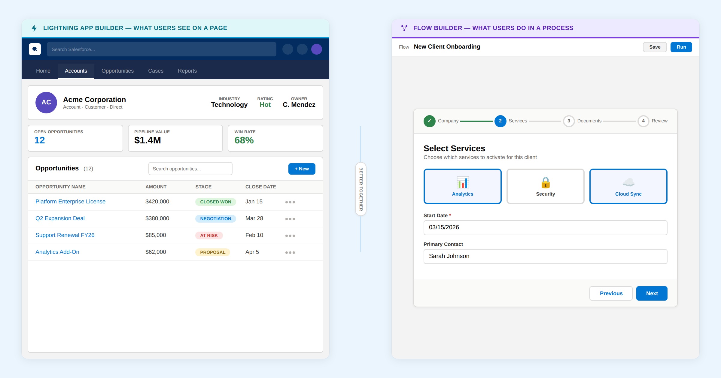
Standard Salesforce reports and lists lack visual impact. They don't drive action. While custom Lightning Web Components (LWCs) or CRM Analytics can solve this, they introduce complexity that most teams can't sustain.
There's a better way. Combine Screen Flow Builder with Avonni's component library to build interactive, dynamic visualizations without the overhead of custom development.
Building an interactive map
Picture a live map within your Screen Flow. It responds instantly to user interaction—filtering data, updating metrics, loading locations dynamically as users pan and zoom. The map stays synchronized with user actions. Data loads efficiently based on what the user is actually viewing.
Metrics: real-time and responsive
Avonni's Metrics components display location data—counts and breakdowns by type—at the top. These aren't static numbers. They update in real time as users interact with the map, delivering the responsiveness users expect from modern applications.
The map: reactive and performant
The map updates markers and metrics dynamically with every pan or zoom. Users get a smooth experience without lag.
Why Screen Flows?
You might assume Screen Flows are for multi-step data collection workflows. They offer much more than that.
We chose Screen Flows for this solution because they deliver:
Flexibility: Adapt to changing requirements without redeployment.
Accessibility: Admins and business users own the configuration.
You get powerful functionality with sustainable maintenance overhead.
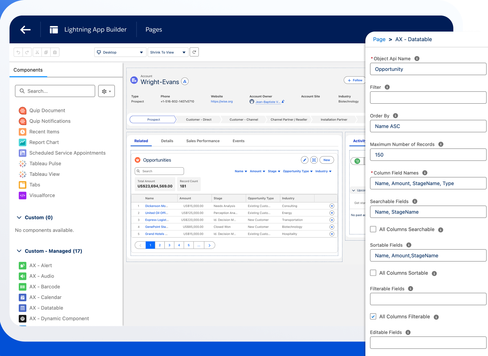
Flow structure: simple and focused
The flow structure intentionally stays minimal. One screen acts as the canvas for the map and metrics. This avoids unnecessary complexity and keeps the focus on the visualization itself.
Under the hood: dynamic formulas
The magic is in dynamic formulas. They act as real-time filters, constantly evaluating map attributes like center point and visible bounds. The Avonni Map only fetches locations within the user's current view. The map responds instantly to pans and zooms while handling large datasets efficiently.
Calculates distance: Measures the distance in kilometers between each location record's Location__c field and the current map center.
Compares to visible bounds: Checks if the distance is less than the visible map width.
Filters results: Includes the location if it's within view, excludes it otherwise.
This simple formula ensures only visible locations load, keeping performance tight.
Requirements:
Select "Leaflet" as your map type in the Avonni Map settings.
Ensure each record has latitude and longitude values in its geolocation field.
For the metrics: refined filtering
The metrics component uses the same core distance logic, plus an additional filter for specific categories.
The metrics formula adds one filter condition: AND Type__c = 'Bakery'. The metric counts locations that are both within the visible map area and classified as the target type.
Real-world use cases beyond the basic example
Interactive maps solve different problems depending on your industry and workflow.
Field service routing and dispatch
Field service teams need to see where jobs are, prioritize by location, and route efficiently. A map-based flow gives your dispatcher immediate visibility into all open service calls, pinned to their locations. Add a metric showing jobs by priority or technician, and dispatchers instantly identify bottlenecks.
Territory and district visualization
Sales managers need to understand territory coverage and account distribution. A map flow shows all accounts or opportunities within a sales region, color-coded by territory or assigned rep. Add metrics showing pipeline value by territory, and managers see immediately which areas are under-resourced.
Store locator for Experience Cloud
Embed an interactive map flow into your Experience Cloud portal so customers find locations themselves. The map shows store hours, current inventory, or service availability. Customers zoom to their area and see which locations are nearest. No help desk calls needed.
Ensuring your data is location-ready
Maps only work if your records have valid geolocation data. Before building your first map flow, prepare your data.
Checking for complete geolocation fields
Run a report on your object and filter for records where your geolocation field is empty. For records with addresses but no coordinates, use Salesforce's geocoding to populate the geolocation field in bulk. For records where location is genuinely unknown, exclude them with a WHERE clause in your map formula.
Handling records without coordinates
Your map formula handles this gracefully. The DISTANCE function returns empty/null for records without valid geolocation data. These records simply don't display as markers. Consider adding a note in your flow: "Showing X of Y locations. Z records have no location data."
Plain markers look generic. Differentiate location types with colors, icons, and custom styling.
Using color-coding by type
Avonni Map supports custom marker colors based on record field values. If your records have a Type__c field (Bakery, Coffee Shop, Restaurant), assign a color to each type. Configure this using the "Marker Color Field" setting.
Icon selection for visual clarity
Beyond colors, use icons that match Salesforce's icon library. A bakery shows a standard:store icon. A service location shows standard:location. Each icon reinforces what the marker represents.
Performance with large datasets
Your map formula's distance-based filtering handles scale well.
The distance-based filter advantage
Your formula fetches only the records visible in the current map view. When your user is looking at a neighborhood, they're loading maybe 20-50 markers. When they zoom out, they might load 500. The map never fetches all 10,000 records at once. This approach scales naturally.
What slows down maps (and how to fix it)
Maps get slow for two reasons: loading too many records at once, or complex record lookups in your formula. If your formula is missing the distance check, you might be loading thousands of markers. Complex lookups (like Account.Name instead of Name) degrade performance. Keep your map display field simple. Test with your actual dataset and watch for lag.
Combining maps with other Avonni components
Maps work especially well with reactive components — when a user interacts with one component, the map updates automatically.
Map plus data table
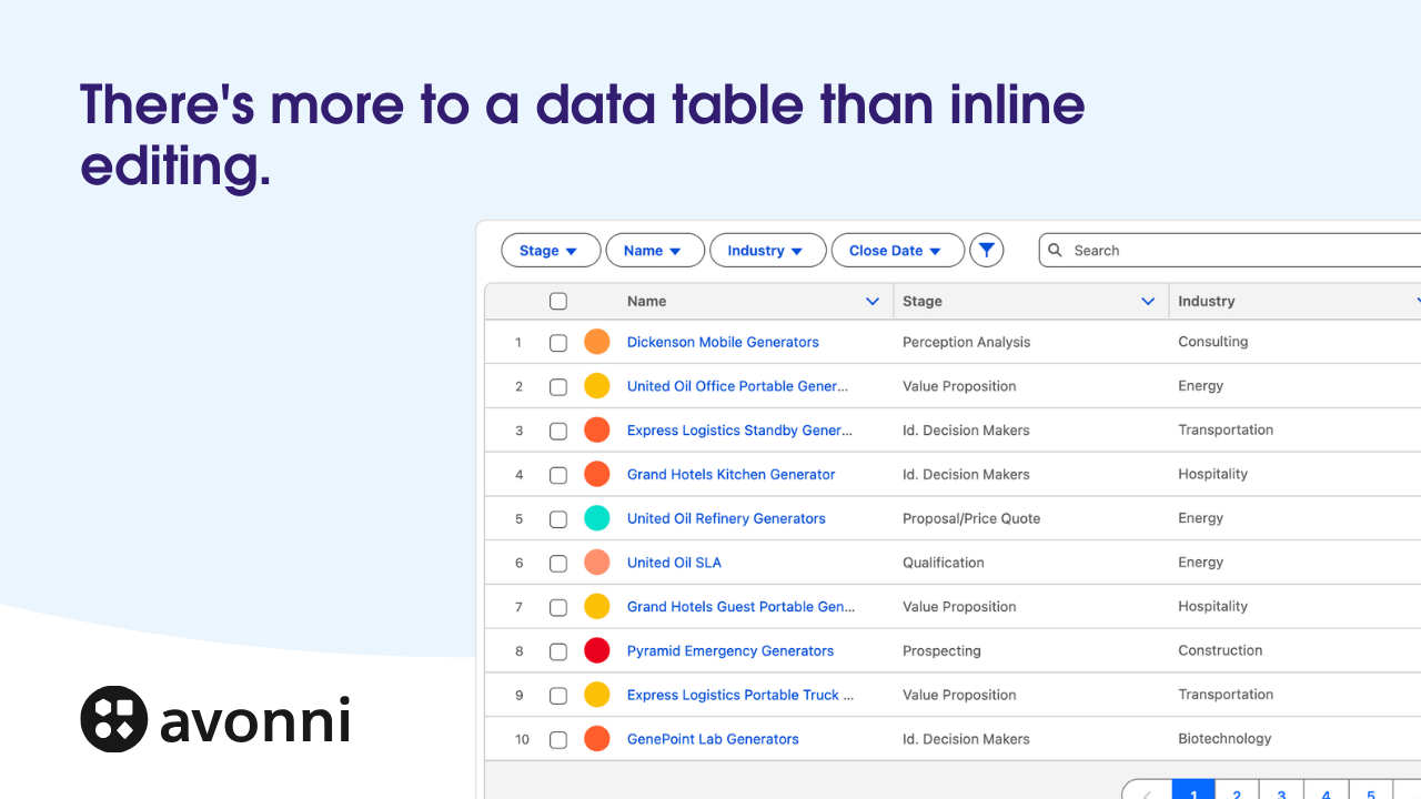
Add an Avonni Data Table below your map showing the same records. Users click a location on the map, that record highlights in the table. Both views always in sync.
Metrics and filters above the map
Place Avonni Metrics at the top showing aggregates. Add filter buttons that update your distance formula and metrics in real time. One interaction, multiple components reacting.
Practical layout structure
Organize your flow screen top to bottom: Metrics showing totals, filter buttons/toggles, map (primary visualization), data table (secondary view). This matches how users naturally scan content.
Elevate your Salesforce experience
This is one example of building dynamic, interactive maps within Flow Builder.
Key takeaways:
Push beyond standard tools: Standard reports are sufficient for static views. Flows and Avonni components unlock interactive experiences.
Prepare your data: Valid geolocation data is the foundation. Invest in data cleanup upfront.
Differentiate with colors and icons: Visual variety helps users instantly understand what they're seeing.
Design for scale: Distance-based filtering means your maps perform well even with large datasets.
Combine components: Maps work best alongside tables, metrics, and filters.
Start experimenting with Flow Builder and push the boundaries of what your Salesforce implementation can deliver.


.png)
.png)
.gif)
.png)
.png)
.png)


%20(Vignette%20YouTube)%20(11).png)
%20(Vignette%20YouTube)%20(10).png)
%20(Vignette%20YouTube)%20(65).png)